Friday, July 30, 2010


Ladybird Book art. The publishers of Ladybird children's books have belatedly realised that there is a great interest in the illustrations used in their classic 60s and 70s series. Now a print-on-demand service is available. Its certainly not cheap but there are some beauties which are all the more evocative because they are bereft of text.

Here are some of my favourites, including a Ron Embleton illo from The Story of Newspapers and a glorious Tunnicliffe watercolour from What to look for in Autumn.

Thursday, July 29, 2010


British newsprint fun. Have been spending far too much time poring over these cover galleries of British comics from the 60s and 70s. Girl's comics from this period are a real curiosity because, of course, no boy wouldn't be seen dead holding a copy of Bunty or Penelope. Now I'd love to read them.

Friday, July 23, 2010


Painted Signs blog. I'm always on the look-out for people who share my love of old signwriting and faded advertising from another age. This blog I discovered today records some great 'ghost signs' and commercial mosaics from Southern England and France. See example above. The black and white ghost sign is one I spotted and photographed in Edinburgh this April.

Thursday, July 22, 2010


Dudley D. Watkins galleries. Was delighted to discover these recent online galleries of original artwork by the icon of Scottish comic art Dudley D. Watkins. Some wartime Lord Snooty and 1950s Desperate Dan on show at this site but also more obscure DC Thomson published characters not seen since publication. Take a look here.

Tuesday, July 20, 2010


Drake Ullingsworth comic. Highlight of today was finding Ed Pinsent has a new book out and it features my favourite of his characters, psychic detective Drake Ullingsworth and his Dog. I've just ordered one and you can too here.

Monday, July 19, 2010


Pen and Ink by Eric Fraser. Esteemed British illustrator Eric Fraser is perhaps best known for his creation 'Mr. Therm', a logo he designed in 1931 for the Gas, Light and Coke company. Prolific and consummate, most of his work is well worth looking at, especially his masterly monochrome pen and ink pieces. I'm posting some of these for no other reason that they are great and perhaps the equal of mid-20th Century giants like Bawden, Minton and Rosoman.

Thursday, July 15, 2010


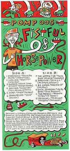
Vesuvius records artwork. Thanks to Flickr I found these nice scans of the artwork I did for Vesuvius records' Travel Companion (book and tape) back in the mid '90s. I can't imagine employing such a bright colour scheme these days but it was fun to come across this again. The label produced some seminal Glasgow produce - all now, of course, long sold out.

Tuesday, July 13, 2010


I've long been fascinated by the syndicated cartoon Horace and Doris. I first came across these antiquated gags in the pages of the Sunderland Echo, where it appears daily on the letters page. After some scouring I've found Horace is published in thirteen UK local and regional papers and its creator, John Morris, a Midlands 'career cartoonist', died in 2000. However, Morris was an old-school pro and drew 6,000 H & D cartoons at a rate of 40 per week(!), so there are still plenty left to publish.


The rather slapdash drawing style puts Horace in an earlier, non-ironic era of say, Larry newspaper cartoons and the subject matter is equally stereotypical. Horace is a long-suffering hen-pecked husband and Doris is a money wasting battle-axe of the Peggy Mount school. Does anyone else enjoy reading these anachronistic sketches? Perhaps its time has already run out because I managed to buy (via an Amazon seller) the 2003 Northern Echo collection of Horace & Doris strips for a mere 1p !


Monday, July 12, 2010


Hello again, retreatants. I'm now back from Spain and once more have my feet planted in Northern English soil. Watch this space for new pleasantly musty comics, illustrations and photographs.

Monday, September 14, 2009


Packing up and moving on. Time to stop posting on this particular blog. Many thanks for reading and commenting. I will be setting up another blog from my new address within the month (using Bagnall in the title). Adios!

Thursday, September 10, 2009


Old School Sign Writing. I've had a couple of sign-writing commissions lately. From these photos of a church sign in progress readers will see I like to follow old methods: lay-out in chalk, lettering in enamel paint, painted with a sable brush. My only concession to modernity is the font style which I initially print out from my laptop. Old craftsmen would snap their Mahl Sticks in disgust!


Sunday, May 31, 2009


Modernist Catholic Churches. These concrete and clear line edifices all date from the late 50s to the turn of the 70s and are from the Archdiocese of Cincinatti. Their mammoth size and confident style all testify to a boom time for American Catholicism when Mass attendance was huge and vocations to the priesthood were at an all time peak. Even new convents were being built at this time. Unthinkable now, when (in the West at least) the thought of a religious vocation is not considered a marketable option.


Monday, May 18, 2009


Here is an overdue posting of vintage shop signs photographed on my holiday to Malta. All of these flaking and crumbling beauties were seen in the lovely capital city Valletta. The majority of these fascia stood above vacant businesses so I suppose some will be disappearing shortly.

Sunday, March 15, 2009


Happy to announce that from Tuesday 17th March I will be on holiday in Malta. This Mediterranean island has 365 churches and its Cathedral in Valletta is home to Caravaggio's painting of The Beheading of John the Baptist, a gloomy baroque picture I have long wanted to see in situ. As this is the third week in Lent it is too early to see any splendid religious festas in Malta but I hope to soak up the island's devout Catholic culture and also some early spring sunshine.

Saturday, February 21, 2009


Pub Signs. These foam-board signs were commisssioned from me by my niece Sarah and her fiancee Craig for their wedding which took place last Sunday. Why pub signs? On their evening "do" they held a pub quiz with team leaders each representing a fictional pub. These signs swung from wooden posts in eight sections of the real pub. The winning team (my sister Elaine's) received cup trophies. Oh and there was fish and chips too. Congratulations Sarah and Craig!